Website design can be the most important factor in whether a user visiting the site converts to a buyer or a client, so it is important to ensure it is both visually appealing and user-friendly. Here are some key factors to consider the 25 Best Website Designs To Look For In 2024 :
-
- User experience (UX): Your website should be easy for users to navigate.
-
- Security: Your website should be secure and protect user data.
-
- Visual presentation: Your website should be visually appealing and reflect your brand identity
-
- Mobile responsiveness: Your website should be responsive and look good on all devices, including smartphones and tablets.
-
- Accessibility: Your website should be accessible to people with disabilities.
-
- Search engine optimization (SEO): Your website should be optimized for search engines so that potential customers can easily find it.
Here Are Our Top 25 Best Website Designs To Look For In 2024:

Digital Mosaik stands out as a compelling design. We have chosen them as one of the 25 Best Website Designs in 2024 for several reasons:
-
Clean and Modern Aesthetic: The site uses a minimalist design with ample white space, which enhances readability and allows key elements to stand out.
-
Interactive Visuals: The site features smooth animations and interactive elements that engage users and create an immersive experience.
-
Clear Navigation: The navigation is straightforward, making it easy for users to find the information they need without confusion.
-
Responsive Design: The site is optimized for different devices, ensuring a seamless experience on both desktop and mobile.
Igloo Inc. exemplifies strong web design through the following features:
-
Engaging Visuals: Animation of a digital igloo draws attention and reinforces brand identity.
-
Interactive Aspects: Interactive properties show up as you scroll down to locate information.
-
Consistent Branding: The uniform use of igloos and snow themes creates a cohesive brand experience.
-
Fast Loading Speed: Optimized for quick loading, the site enhances overall user satisfaction.

Alchemy Digital‘s website demonstrates exceptional design for these reasons:
-
Elegant Typography: The use of sophisticated fonts enhances the site’s sleek and professional look, improving readability and visual appeal.
-
Dynamic Content Display: Interactive elements and transitions keep users engaged, creating a lively browsing experience.
-
Strategic Layout: The layout effectively guides users to key information and calls to action.
-
Clear Brand Messaging: The site communicates the brand’s identity and values, fostering a strong connection with the audience.

Zevi Digital has a strong web design. We have chosen them as one of the 25 Best Website Designs in 2024 for for many reasons, some of them are
-
Smart Colors: The stylish selection of colors represent the unique dynamic of themes on the website.
-
User Experience: The website is easy for users to navigate on any website.
-
Services: The website shows all the services that are offered from the company.
-
Accessibility: The site is comfortably usable by anyone on any device.
Black Fountain Capital’s website highlights effective design for several reasons:
-
Sophisticated Visual Hierarchy: The design guides the viewer’s attention naturally, using contrasting text sizes and colors to emphasize key information.
-
Professional Imagery: High-quality, relevant images are used throughout the site, enhancing the overall professionalism and appeal.
-
Intuitive Navigation: The site’s structure is simple and intuitive, allowing users to easily access information about the company, its services, and portfolio.
-
Engaging Copywriting: The content is concise and well-written, effectively conveying the company’s mission and values.
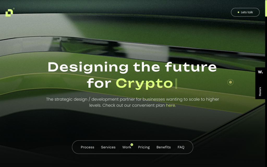
Proyect.io’s website exemplifies innovative design with the following attributes:
-
Striking Minimalism: The site employs a clean and minimalistic design, which creates a modern and uncluttered user experience.
-
Engaging Motion Graphics: Subtle animations and transitions are used effectively to maintain user interest without overwhelming the interface.
-
Clear Call to Actions: The website prominently features clear and compelling calls to action, guiding users towards the next steps.
-
Balanced Color Scheme: A well-chosen color palette provides visual appeal while maintaining a professional tone.
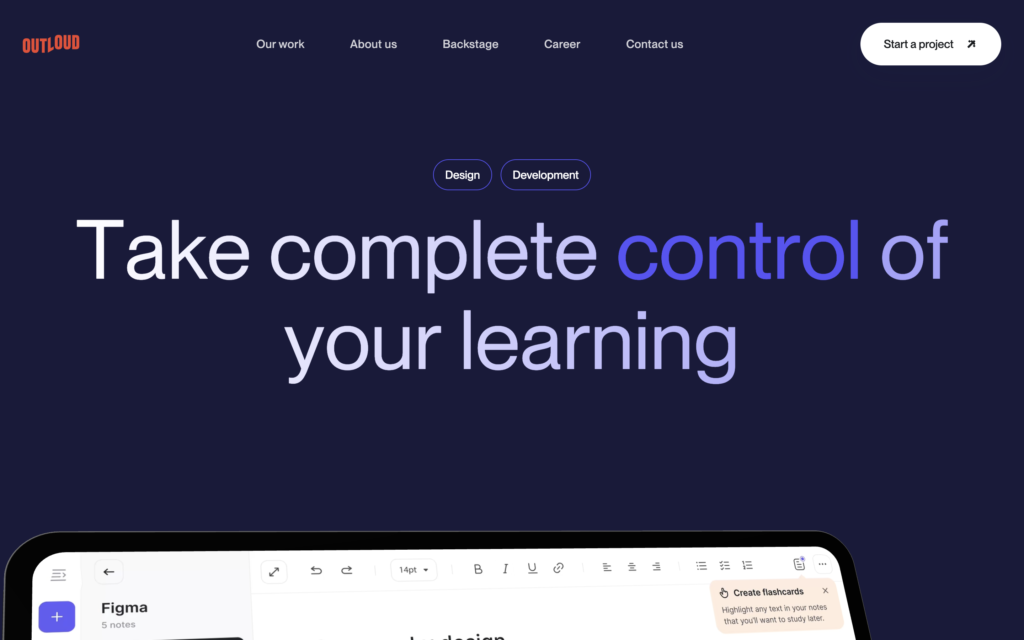
Work.outloud.co stands out as a compelling design for several reasons:
-
Clean and Minimalist Aesthetic: The site uses a minimalist design approach, avoiding clutter and focusing on essential elements, which enhances usability and visual appeal.
-
Consistent Branding: The website features a cohesive color scheme, typography, and logo placement that reinforces the brand’s identity and creates a unified look.
-
Intuitive Navigation: The navigation menu is straightforward and user-friendly, allowing visitors to easily find information and navigate through the site.
-
Responsive Design: The site adapts seamlessly to different screen sizes and devices, providing a consistent and enjoyable user experience whether on a desktop, tablet, or smartphone.
deblank.com stands out as a compelling design for several reasons:
-
Innovative Use of Space: The website effectively utilizes white space, allowing the content to breathe and enhancing the overall readability and visual balance.
-
Engaging Visual Elements: The site incorporates high-quality images and dynamic visuals that capture attention and reinforce the message, making the user experience more engaging.
-
Clear Call-to-Actions: Prominent and well-designed call-to-action buttons guide users towards desired actions, improving conversion rates and user interaction.
-
Dynamic Typography: The use of varied font sizes and styles creates a visually appealing hierarchy and enhances content readability, while also adding character to the design.
ThisIsGravity.co Was Chosen as as one of the 25 Best Website Designs in 2024 for several reasons:
-
Bold Typography Choices: The site employs large, eye-catching fonts that draw attention and clearly convey important messages.
-
Smooth Animations and Transitions: Fluid animations and transitions enhance user interaction, creating a more engaging and modern experience.
-
High-Contrast Color Palette: The high-contrast colors used in the design make key elements pop and improve readability against the background.
-
Effective Visual Hierarchy: The clear visual hierarchy guides users through the content seamlessly, making navigation intuitive and straightforward.
CherryInvestments.eu demonstrates exceptional web design through the following features:
-
Professional and Elegant Aesthetic: The site uses a sophisticated color scheme and clean layout that convey professionalism and instill trust.
-
Well-Structured Content Layout: Content is organized into clear sections with headings and subheadings, making it easy for users to find relevant information quickly.
-
Interactive Elements: Interactive features, such as hover effects and clickable elements, enhance user engagement and make navigation more intuitive.
-
High-Quality Imagery: The site utilizes high-resolution images that complement the content and create a polished, professional appearance.
design2024.calarts.edu excels in web design due to the following features:
-
Visually Striking Layout: The site employs a creative and visually impactful layout that immediately captures the visitor’s attention and reflects the innovative nature of the content.
-
Bold Use of Color: The use of vibrant and contrasting colors enhances the visual appeal and draws attention to key elements, creating a dynamic user experience.
-
Integrated Multimedia: The inclusion of videos, animations, and interactive elements enriches the content and engages visitors in a more immersive manner.
-
Clear and Engaging Typography: The website uses a variety of font sizes and styles effectively, making the content easy to read and adding visual interest to the overall design.
Depoly.co stands out for its web design excellence in several ways. We have chosen them as one of the 25 Best Website Designs in 2024 for:
-
Innovative Layout Design: The site features a unique and non-traditional layout that breaks away from standard formats, making it visually engaging and memorable.
-
Smooth User Interaction: Interactive elements, such as hover effects and dynamic content, provide a responsive and engaging user experience.
-
Effective Use of Imagery: High-quality images and graphics are integrated seamlessly into the design, enhancing the visual appeal and supporting the content.
-
Focused Call-to-Action Buttons: Prominent and well-designed call-to-action buttons are strategically placed to guide users toward key actions, improving navigation and conversion.
BrightWave.io excels in web design due to the following features:
-
Clean and Modern Aesthetic: The site uses a sleek, contemporary design with ample white space, which makes the content easy to read and visually appealing.
-
Consistent Branding: A coherent color scheme, typography, and visual style are maintained throughout the site, reinforcing the brand identity and creating a unified look.
-
Interactive and Engaging Features: Interactive elements, such as hover effects and scroll animations, keep users engaged and make the browsing experience more dynamic.
-
Well-Organized Content: Content is structured with clear headings, concise text, and well-defined sections, allowing for easy navigation and quick access to information
Staffex-ai.com stands out for its web design in several ways:
-
Professional and Clean Interface: The site features a polished and minimalist design that conveys professionalism and makes it easy for users to focus on the content.
-
Clear Call-to-Action: Prominent and strategically placed call-to-action buttons guide users toward key actions, enhancing usability and driving engagement.
-
Responsive Design: The site adapts seamlessly to various devices and screen sizes, ensuring a consistent and user-friendly experience across platforms.
-
Effective Use of Icons and Graphics: The use of intuitive icons and visuals supports the content and helps users quickly understand the site’s offerings and functionality.
bff.makeitmovie.org excels in web design for the following reasons:
-
Creative and Playful Aesthetic: The site uses vibrant colors, bold typography, and whimsical design elements that capture the essence of creativity and fun, aligning with the theme of the project.
-
Interactive Storytelling: Engaging interactive features and animations enhance the storytelling experience, making the site more immersive and enjoyable for users.
-
User-Friendly Navigation: The navigation is intuitive and well-organized, allowing visitors to easily explore different sections and access information without confusion.
-
High-Quality Visuals: The site integrates high-resolution images and graphics that complement the content and contribute to a visually appealing and engaging experience.
weareuprising.com showcases strong web design through the following features:
-
Bold and Dynamic Visuals: The site uses striking images and video backgrounds that capture attention and convey a powerful, energetic message.
-
Innovative Scrolling Effects: Unique scrolling animations and transitions provide a smooth and engaging user experience, enhancing the site’s overall appeal.
-
Strong Brand Identity: Consistent use of colors, fonts, and design elements reinforces the brand’s identity and creates a cohesive visual experience.
-
Effective Content Hierarchy: The layout is structured to highlight key information and calls-to-action prominently, ensuring that users can easily find and interact with essential content.
useparallel.com demonstrates excellent web design through the following features:
-
Minimalist and Sleek Design: The site uses a clean, minimalist design that emphasizes key content and reduces visual clutter, making it easy for users to navigate.
-
Intuitive User Interface: User interactions are streamlined with clear navigation paths and well-organized content, providing a smooth and efficient browsing experience.
-
Engaging Visual Elements: High-quality graphics, icons, and animations are used to visually communicate concepts and enhance user engagement.
-
Responsive and Adaptive Layout: The website adjusts seamlessly to various screen sizes and devices, ensuring a consistent and user-friendly experience across all platforms.
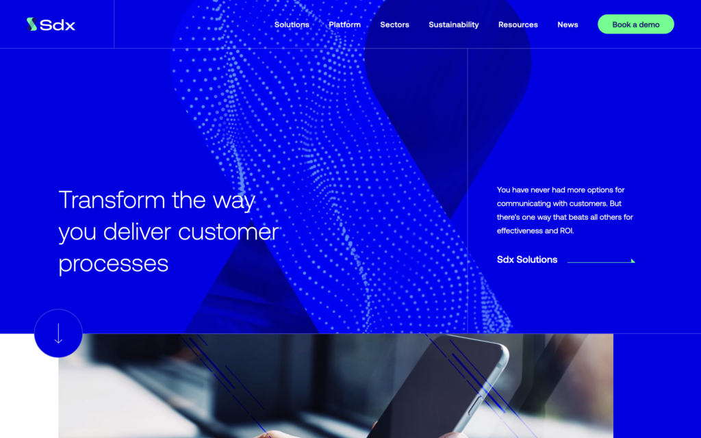
sdxmessaging.com excels in web design for the following reasons:
-
Professional and Corporate Aesthetic: The site features a polished and sophisticated design that reflects the professional nature of the service, reinforcing trust and credibility.
-
Clear and Direct Messaging: Key information and value propositions are prominently displayed with concise, impactful text, making it easy for users to understand the service offerings.
-
Structured Content Layout: Information is organized into clearly defined sections with headings and subheadings, which aids in easy navigation and improves the overall user experience.
-
High-Contrast Color Scheme: The use of contrasting colors for text and background enhances readability and highlights important elements, making it easy for users to focus on key content.
Stripe.com stands out in web design for several reasons:
-
Clean and Modern Design: The site uses a sleek, contemporary design with plenty of white space, creating a professional and uncluttered look that emphasizes key information.
-
Effective Use of Visual Hierarchy: Clear typography and strategically placed content ensure that important details, such as pricing and features, are easily accessible and readable.
-
Interactive and Engaging Elements: Interactive components, such as dynamic charts and hover effects, enhance user engagement and provide a more immersive experience.
-
Consistent Branding: The site maintains a cohesive color scheme, typography, and visual style throughout, reinforcing Stripe’s brand identity and creating a unified experience.
Moooi.com excels in web design for the following reasons:
-
Artistic and Unique Aesthetic: The site features a distinctive, artistic design with bold imagery and creative layouts that reflect Moooi’s innovative approach to design.
-
High-Quality Visuals: The use of high-resolution images and videos showcases Moooi’s products in a visually compelling way, enhancing the overall presentation and appeal.
-
Dynamic Content Presentation: Interactive elements, such as scrolling effects and animations, bring the content to life and create a more engaging user experience.
-
Sophisticated Typography: The site employs elegant and varied typography that complements the artistic theme and enhances the readability and visual interest of the content.
ideo.com stands out in web design due to the following features:
-
Innovative Layout: The site employs a creative and fluid layout that reflects IDEO’s design thinking philosophy, allowing for dynamic and engaging content presentation.
-
Strong Visual Storytelling: High-quality images, videos, and infographics are used effectively to tell stories and illustrate IDEO’s projects and processes, enhancing the user experience.
-
Clear and Functional Navigation: The navigation is intuitive and well-organized, allowing users to easily explore different sections and access relevant information.
-
Consistent Brand Identity: The use of consistent colors, typography, and design elements reinforces IDEO’s brand and creates a cohesive visual experience across the site.
Activetheory.net excels in web design due to the following features:
-
Innovative Interactive Elements: The site uses cutting-edge interactive features and animations that engage users and create a memorable browsing experience.
-
Visually Appealing Layout: A modern, visually striking layout with a focus on aesthetics and design principles enhances the overall user experience.
-
Effective Use of Multimedia: High-quality videos and animations are integrated seamlessly, providing dynamic content that enriches user engagement.
-
Intuitive Navigation Design: The site’s navigation is well-structured and easy to use, allowing visitors to quickly find information and explore various sections.
Baseborn.studio showcases excellent web design through the following aspects:
-
Creative and Immersive Design: The site features a visually striking and immersive design that captures the essence of Baseborn Studio’s creative work.
-
Bold Typography and Visuals: The use of bold typography and high-quality visuals creates a strong visual impact and effectively communicates the studio’s unique style.
-
Interactive User Experience: Interactive elements, such as hover effects and dynamic content transitions, engage users and enhance the overall browsing experience.
-
Well-Organized Portfolio Display: The site presents the studio’s portfolio in a clear and organized manner, allowing visitors to easily view and appreciate the range of projects and creative work.
CriticalDanger.com stands out in web design for the following reasons:
-
Intense Visual Impact: The site uses dramatic imagery and bold color choices to create a powerful and memorable visual experience that reflects its critical theme.
-
Dynamic and Interactive Features: Interactive elements, such as animations and hover effects, enhance user engagement and make the content more compelling.
-
Effective Use of Contrast: High-contrast color schemes and typography improve readability and draw attention to important elements, ensuring key messages stand out.
-
Focused Content Presentation: The layout is designed to highlight essential information and guide users through the content efficiently, making it easy to access and understand critical details.
Flyhyer.com excels in web design through the following features:
-
Clean and Modern Interface: The site features a sleek, minimalist design that emphasizes clarity and ease of navigation, providing a professional look and feel.
-
Engaging Visual Elements: High-quality images and smooth animations create an engaging experience and highlight key features effectively.
-
User-Friendly Navigation: The intuitive layout and well-organized menu structure make it easy for users to find information and explore different sections of the site.
-
Responsive Design: The website adapts seamlessly to various devices and screen sizes, ensuring a consistent and pleasant user experience across platforms.
Alchemy Digital‘s website demonstrates exceptional design for these reasons:
-
Elegant Typography: The use of sophisticated fonts enhances the site’s sleek and professional look, improving readability and visual appeal.
-
Dynamic Content Display: Interactive elements and transitions keep users engaged, creating a lively browsing experience.
-
Strategic Layout: The layout effectively guides users to key information and calls to action.
-
Clear Brand Messaging: The site communicates the brand’s identity and values, fostering a strong connection with the audience.
